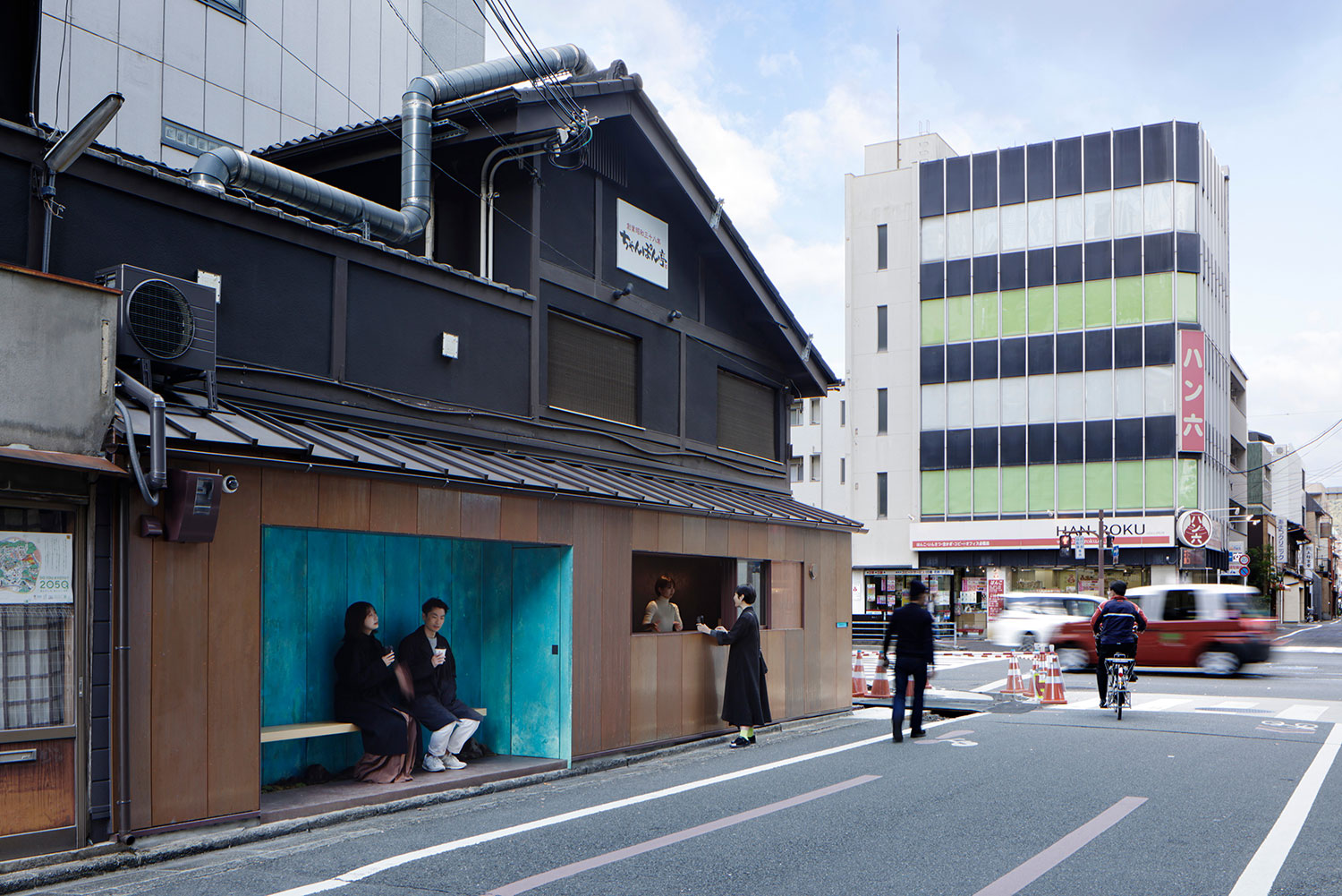
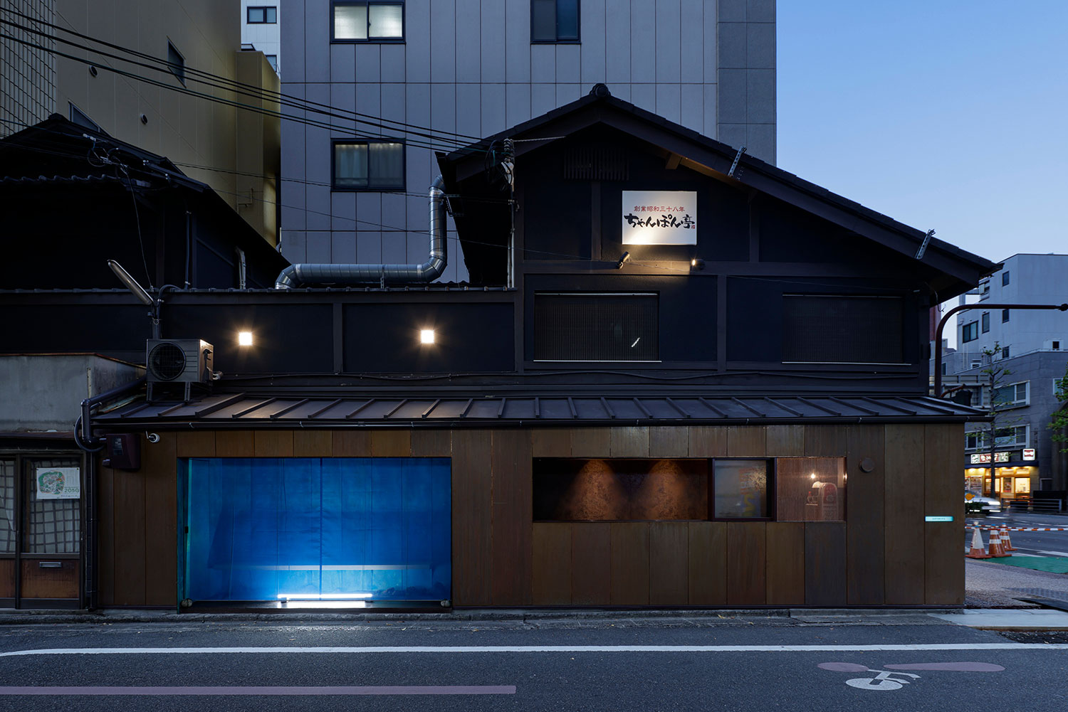
Crafted by the innovative minds at t G Architects Studio, this bold coffee stand is a testament to the forward-thinking approach of AoQ, a new brand launched by the renowned Suetomi confectionery shop in Kyoto. Positioned on the bustling Karasuma-dori street, which stretches from the Kyoto train station, the stand occupies the ground floor of a quaint two-story wooden structure, perfectly situated at an intersection flanked by hotels and office buildings.
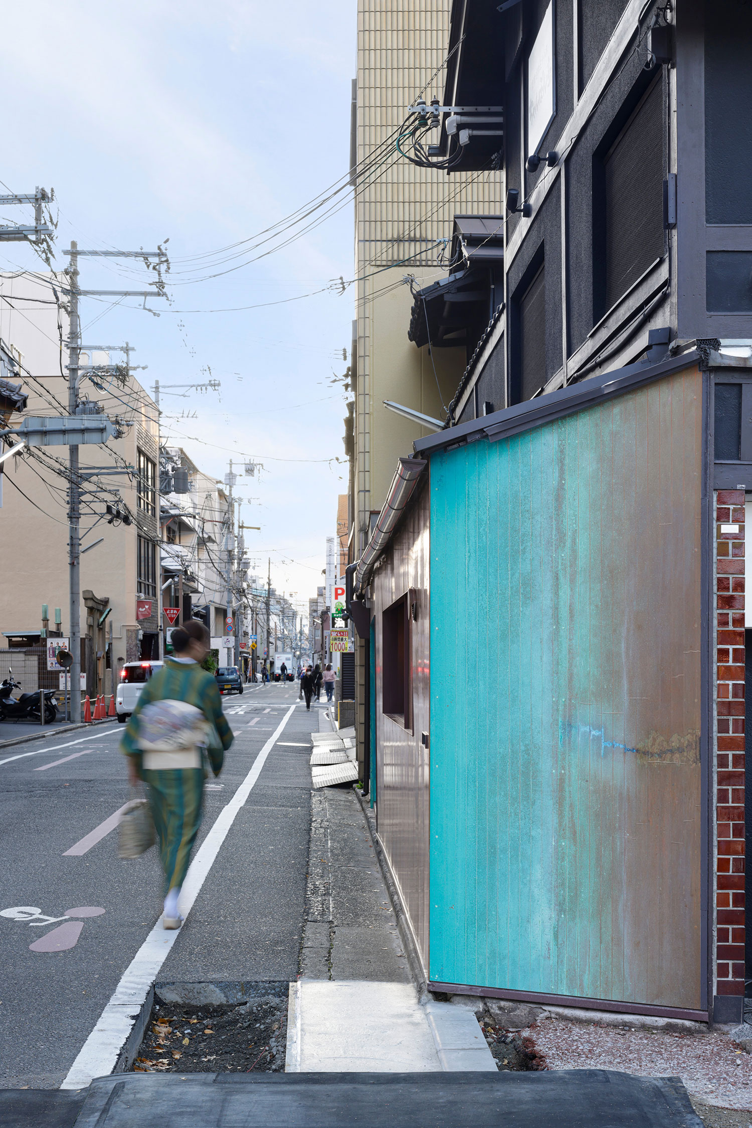
With a mere depth of about 1 meter, this coffee stand is so petite and unassuming that it can easily blend into the vibrant street scene. Its compact size allowed for a swift decision on the layout, leading to a clever arrangement where the kitchen and resting area are placed side by side, right at the front along the street. The simplicity of the floor plan was almost instinctive, yet the design team dedicated considerable time to perfecting the stand’s elevations.
A pivotal choice was made to focus on the vertical aspects of the stand, delving into both its interior and exterior design. The architects undertook a fascinating experiment to chemically influence the aging process of the copper, aiming to create a unique aesthetic that evolves over time. This thoughtful approach not only enhances the visual appeal but also adds a layer of character to the stand, making it a distinctive feature in the lively urban landscape.
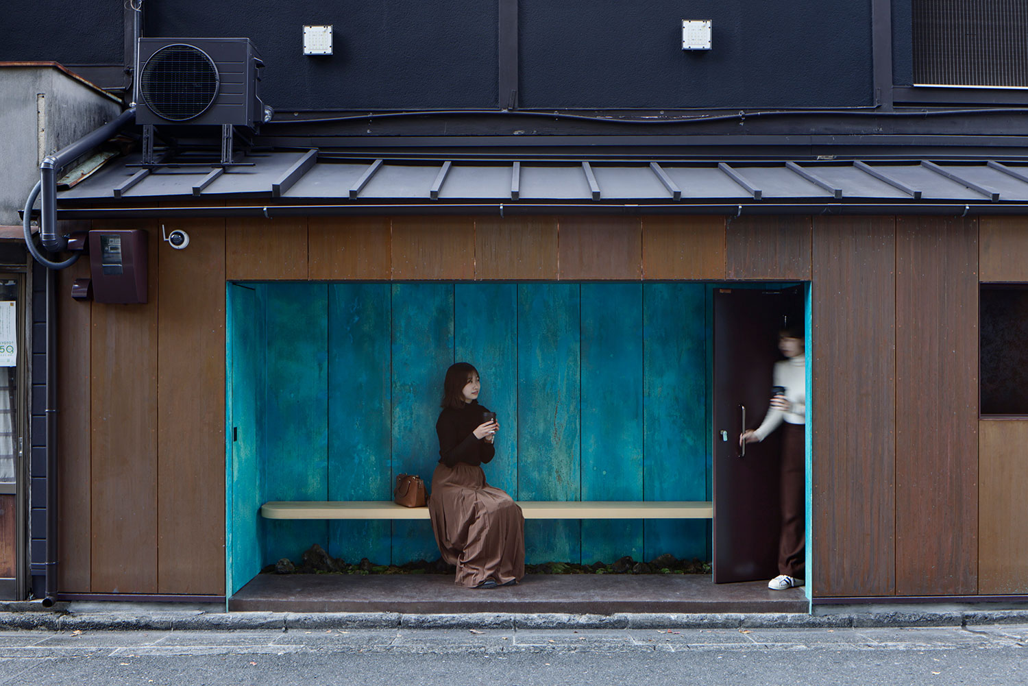
Copper foil was affixed to the wall and treated with soy sauce and various chemicals to induce oxidation. This artistic process aimed to craft a facade that evokes the essence of Suetomi’s, a venerable confectionery shop nestled in Kyoto. The resulting rusty patina color mirrors “Suetomi blue,” the signature hue that has represented the brand for over seventy years.
Located just a short three-minute stroll away, Suetomi’s flagship store inspired the design of this stand, which was envisioned as a prominent signboard, one meter thick, guiding customers from the bustling street to the main shop. The distinctive patina color was strategically applied to two key areas: the striking side that faces the intersection and the cozy resting area, ensuring visibility and allure.
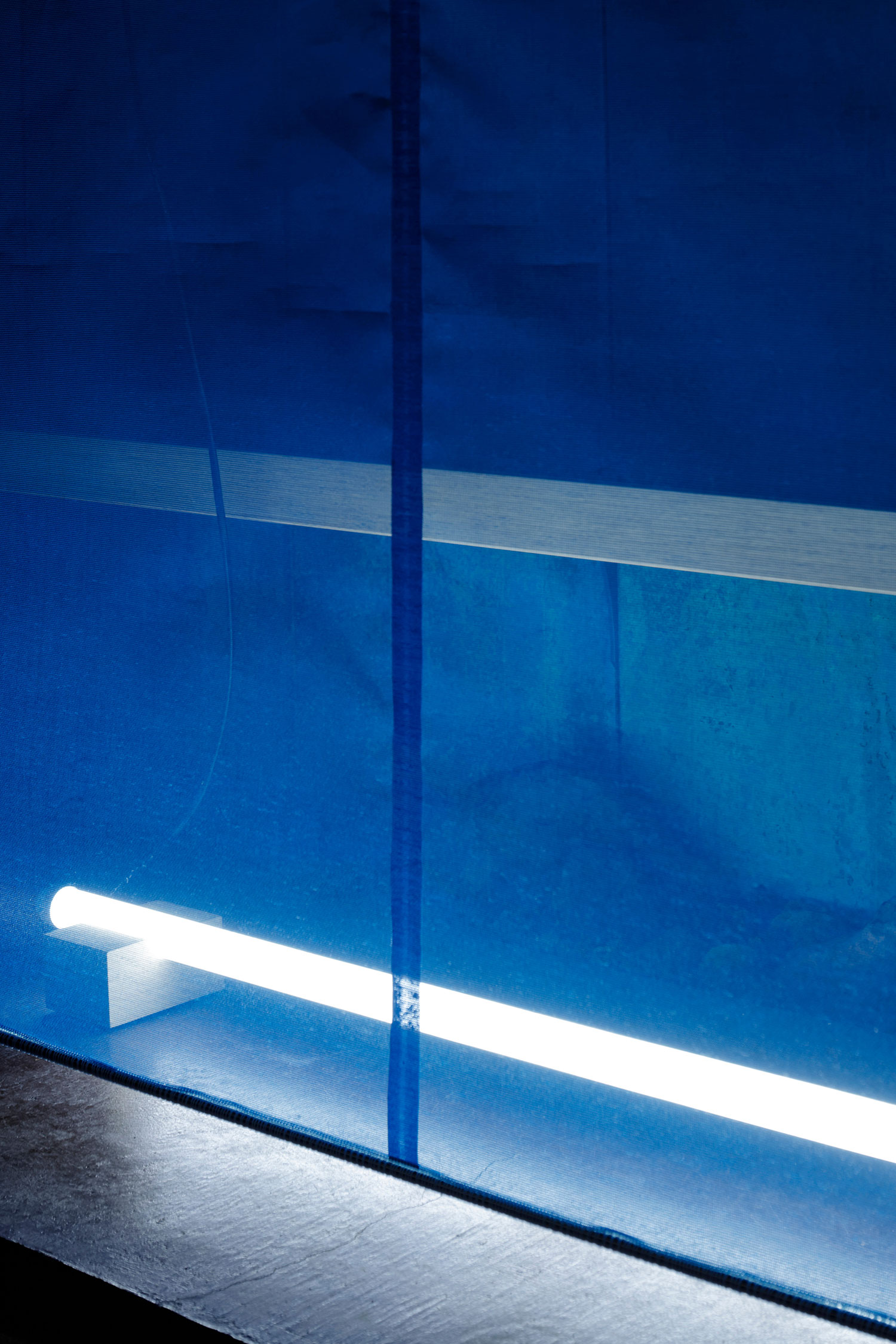
Cityscape regulations typically restrict facade colors, allowing only natural materials. However, the local government approved this unique color application since it was achieved through oxidation rather than paint. The careful use of soy sauce facilitated a gradual corrosion of the copper, yielding a rich reddish-brown hue, while ammonium chloride accelerated the process, creating the desired patina. Without these treatments, the copper would have taken months and even years to develop the same vibrant colors.


